

Best Practices for Large Content Driven Presentations
Arreya lets you create presentations without page restrictions or limits on content. However, this freedom can cause unexpected experiences when dealing with large amounts of content. A large presentation gets affected by device limitations, internet speed, storage, and processing power. Yes you can create a presentation with over 200 pages and gigabytes of content but unless optimized, this content will not be easy for devices to deal with. Much like a web site there are best setups and recommendations to create it to be highly performing.
When a presentation gets really large with content, the usability gets complicated and affects both viewing and editing. A 200 page interactive presentation needs a lot of computing power, so it may not load properly, and a computer may lack the processing power to easily edit all 200 pages at once. If your internet speed is slow or lags, the entire presentation will take a long time to load, push live, and edit.
How to Optimize Large Content Driven Presentations
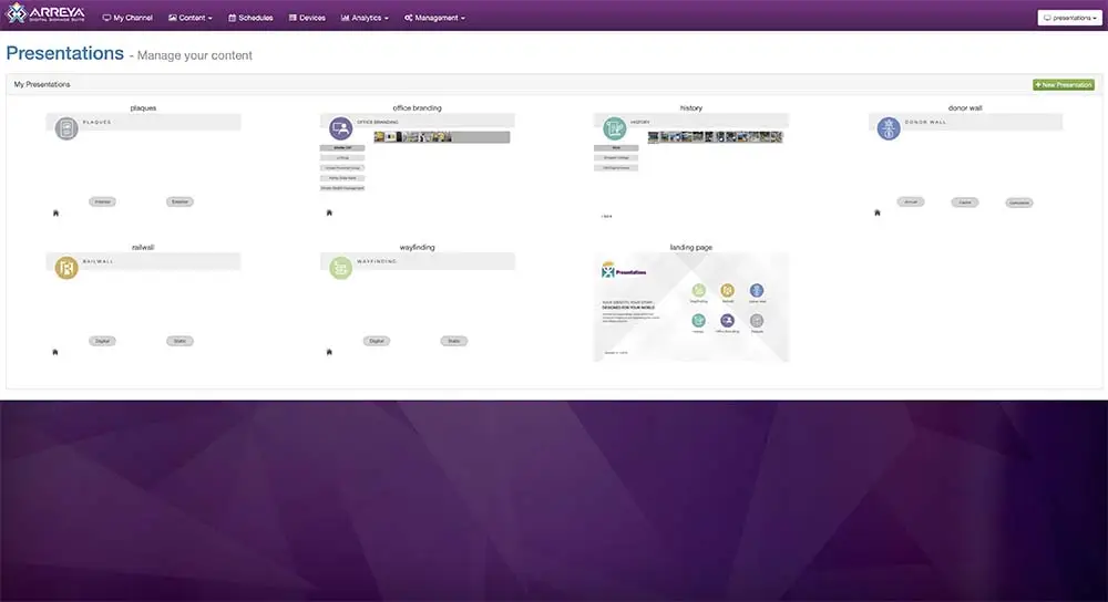
The good news is, with Arreya, you can still design and create a large content driven presentation by best optimizing it for performance. This optimization is achieved in Arreya by splitting up your content into multiple presentations. So now, you can divide one extremely large presentation into many smaller and more manageable sections. This multi presentation feature in Arreya is a game changer. It makes loading and organizing content much faster, and is included with every subscription. Arreya also has no limits on the number of presentations you can add and includes options to link presentations together for a seamless experience.
Taking advantage of this Arreya feature and using our optimization recommendations below will give you the best experience with your large content driven presentation.
Planning For Splitting Up Large Presentations
Splitting up presentations doesn’t have to be complicated or time consuming. Understanding how to best organize your presentations is key at the beginning. The number of pages we recommend is 30 pages per presentation. But don’t be worried about having a lot less, that is even better. We have even set up some presentations with just one page linking to many sub presentations. There is no specific formula or equation to splitting up your content, but thinking about how to best divide up your content before you start will result in less reworking.
Split by Navigation Buttons
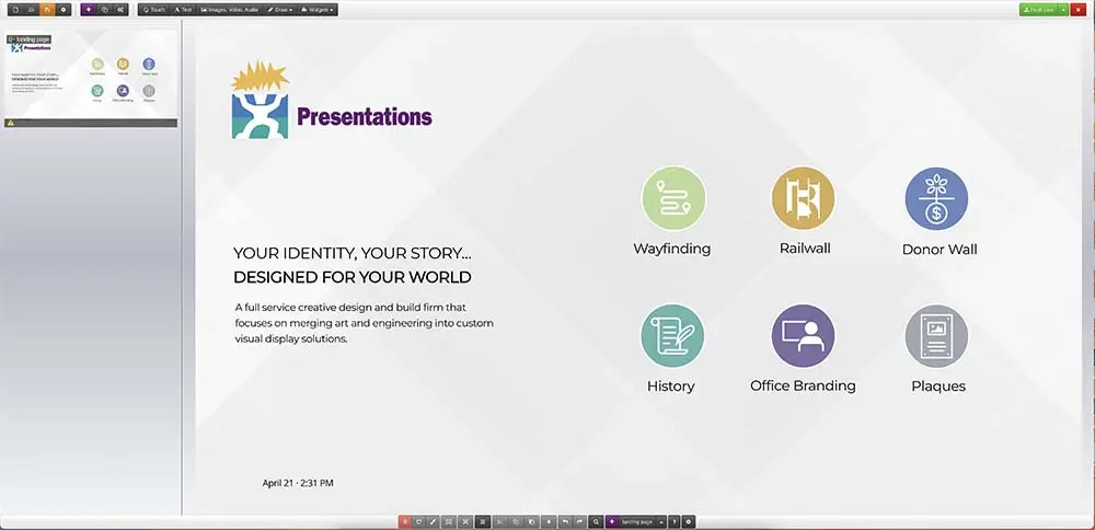
One way to split up your interactive content is to create a presentation for each navigation button. If there is navigation on your home page to 5 categories then a simple breakdown would be to create 5 presentations, one for each of those categories. Each button would then link to the corresponding presentation. This also helps you easily organize your content to just those pages, giving you less pages to sort through so you can quickly make edits and navigate.
Split by Categories
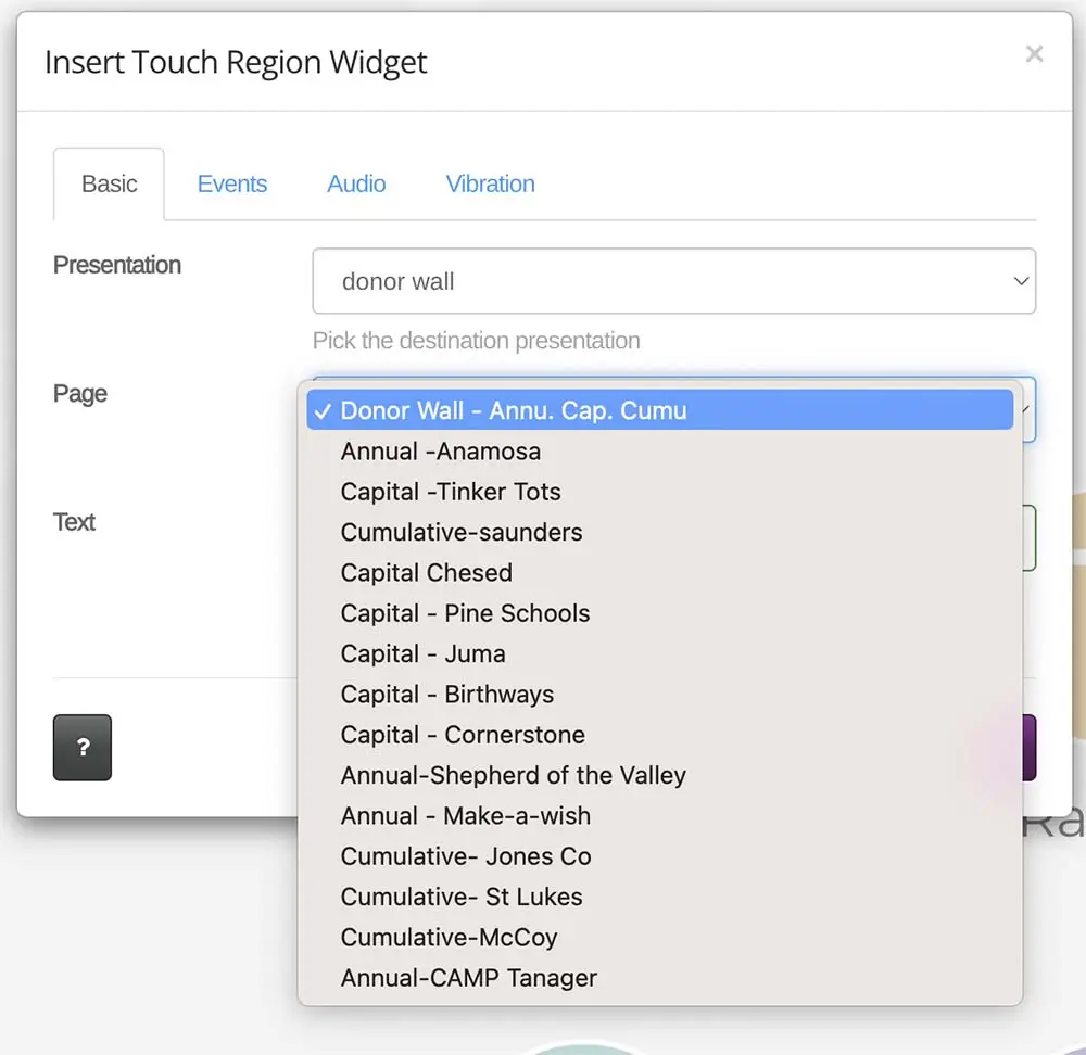
If you have lists or menus of content within a page then splitting off the listings into presentations would be best. This is a great solution for a donor listing that divides individuals’ content by an alphabetical list to choose from. So if your donor list had a section of names “A-D” the link would be to a new presentation, not to a page within the same presentation. The navigation on the “A-D” presentation would return back to the alphabetical listing on the previous presentation.
Now all your photos, content, and names can easily be added to the section they belong in. This is especially helpful for long listings, not only for donors, but also products or services can also be handled this way. Then, when you have new content to add, you can open the specific presentation for the category and make the change. This will take less time to navigate, load quicker, and make edits easy.
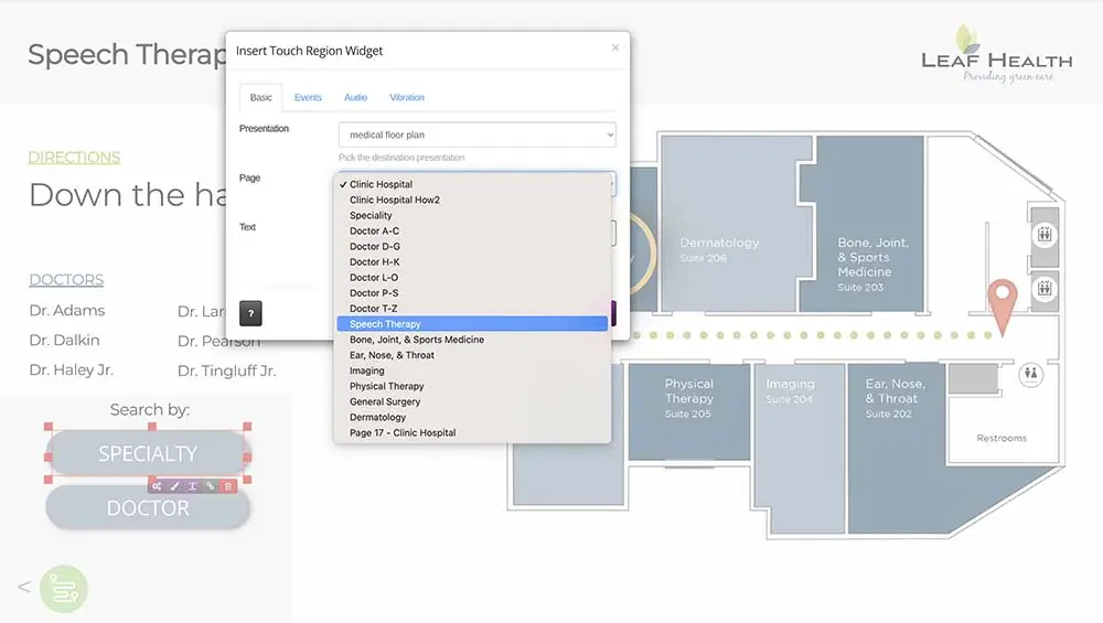
Split by Locations
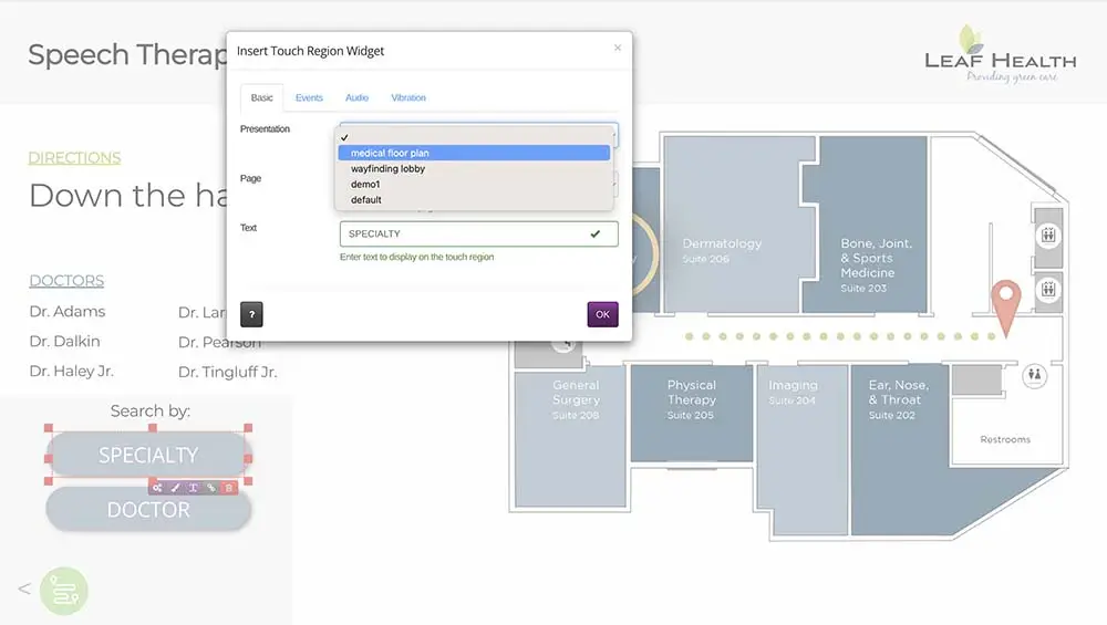
If you are setting up wayfinding or directories, then the best practice is to split each area up into its own presentation. For campus mapping, you would split up the presentations to the buildings identified, then have all the details of each building in one presentation. If you have a hospital map you can set up a presentation for each floor or department.
Split by Content
Another best practice for large content driven presentations is to set up presentations based on the amount of content. Videos can have a lot of loading time for rendering. They are the largest content type to work with, so if you have a lot of videos, try to split them evenly onto presentations. 2-3 videos per presentation is a good target. If you have more make, sure to split them up. Images can also add up and need to be planned around. If you are having lots of gallery photos or slideshows, say for a yearbook or history wall, we recommend you split those off into presentations, then create navigation to return to the main presentation. 20 – 30 images per presentation is a good target. If you have more images split them off into additional presentations.
Setting up Multiple Presentations
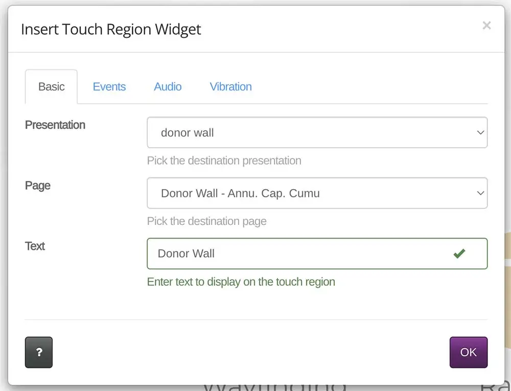
Start by designing your home page and top level content as a presentation. After you determine your overall design, layout, and navigation, you will want to save out pages and presentations as templates. Now you can begin additional presentations by importing template pages into the layouts. This speeds up layout time so that they will look and feel seamless. When setting your navigation you will then link your presentations together under the widget options. Make sure to change which presentation is selected as the destination, then choose the page in that presentation you want to go to, and finally name the button.
Optimizing Tips In General for Presentations
Naming Pages – When you add a page to your presentation, name it in the settings. Choose the name based on what you would title a button for this page to be called. This way when you select a page as a touch point, it will automatically name the button as the page name. This saves you from typing in a name every time, which adds up over 100+ pages of design.
Video Length – The longer the video, the larger the file size. Can the video be broken up into smaller sections? If possible, we recommend using videos under 30 seconds to keep viewers engaged with your display. Arreya has a file upload limit of 2 gigabytes, and long videos may reach this limit.
Plan for Growth – If you know you will be adding sections or content for new events or areas, set up navigation and additional presentations to leave room for adding future content. This will prevent having to redesign areas or all your pages in the future. Instead you can hide these links in the initial design, and in the future, make these areas visible, and link to a new presentation you can add the new content to.
That covers many of our recommendations for optimizing large content driven presentations in Arreya. We hope you now know some best practices our designers use, and understand how to best approach a large content driven presentation. We are always here to help, and can answer additional questions.
Feel free to email support@arreya.com, or call us at (319)-294-6671. Also, check out our full Knowledge Base.